The purpose of this project was to conduct a user experience assessment of existing product listing
pages for Hugo Boss.
I needed to come up with interactive prototypes for desktop and mobile breakpoints.
Product listing pages are key hub pages in any e-commerce store. They allow users to visually forage
a group of products, as well as review additional product details to help them further differentiate
products without clicking into the product page for full details.
It was an internal project for my employing company. It didn't target for a real client.
And it took me about 40 hours during 2-3 week on a part time basis.
The Brief
The brief of this project was to have the necessary information to generate a proposal on how to
increase
conversion of existing apparel store: defining which areas and features are causing headaches for users
and providing suggestions to fix detected issues.
Industry / Webstore: E-Commerce / Hugo Boss.
Scope: Product Listing Pages (PLP).
Services: UX Assessment and Prototyping.
Deliverables: UX Audit Report and Interactive Prototypes.
Target Screens: Desktop and Mobile.
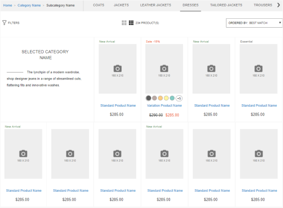
Why Is Product Lists Usability So Important?
Their main goal is to funnel visitors to the right product page and thereby it should include
the essential information to help visitors find the right product for their needs. Any element that
distracts the visitor from that goal should be removed.
If users can't easily browse through product lists, they can't simply find what they are searching for –
and if they can't find it they can't buy it.
“During the study, sites with mediocre product list usability saw abandonment rates of 67-90%, whereas sites with just a slightly optimized toolset saw only 17-33% abandonment for users trying to find the exact same types of product. This translates into as much as a 4-fold increase in leads.”
(from: Baymard Product Lists Report)
What Is UX Prototyping and Why Is It Important?
User eXperience prototyping gives everyone in a team a single idea to work from and is a far more
effective way to communicate a designer’s intent than a group of static wireframes or UI mockups.
Interactive prototypes aim to show an entire team exactly how the system should react on a user's
actions, rather than leaving this open to interpretation by the rest of the team.
02 / The approach
1. Research and Discovery
I was new to the e-commerce industry. Hence, I took the time to study the subject features:
I investigated a user needs and mapping of key e-commerce components to conversion funnel.
I explored competitors taking notes about good solutions and inspirational layouts.
I studied applicable researches and best practices.
2. User Experience Audit
Solo heuristic evaluation was my point-of-departure and source of valuable information for the next
steps.
To present the audit report to external stakeholders, I sent some time to develop an UX Audit
Template that helped me to communicate the findings in a more clear and comprehensive manner.
3. Interactive Prototyping
Finally, I combined my UX suggestions in a single layout to polish and visualise suggested
optimizations.
03 / The process
1. Research and Discovery
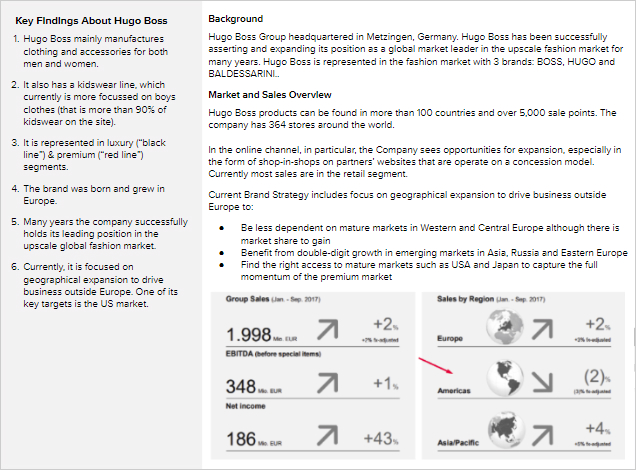
Brand overview
I began the case study phase from the investigation of public information: the brand history, product
lines
segments, target markets, and strategic goals.
Through a quick review of published information, I got an initial understanding of the brand, market
segments, and target audience.
Figure 3-1: The brand overview summary.
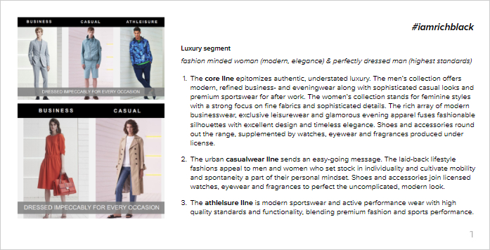
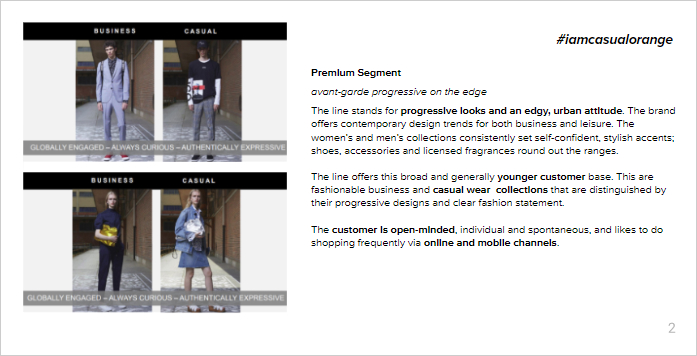
Figure 3-2: Target audience overview. Hugo Boss offers its products in luxury (1) and
premium (2) segments.
User Personas
As it often happens with short-term projects, I was very limited in time and resources. I had no
possibility to collect and appropriately analyze first-hand data about the website users. I, therefore,
created ‘provisional personas’ based on target audience understanding and
common shopper
types defined by the NNGroup researches
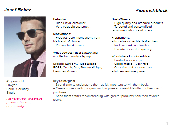
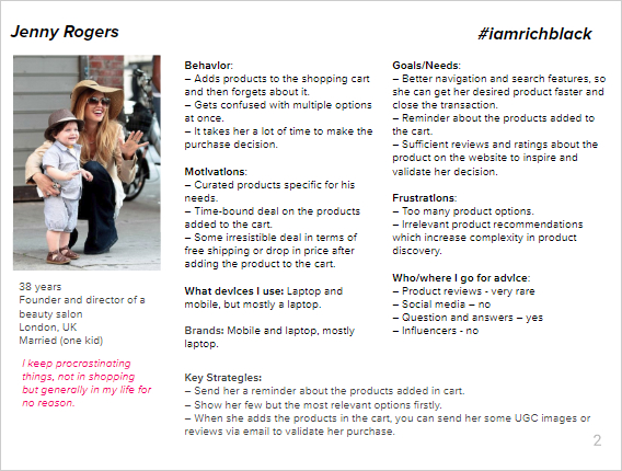
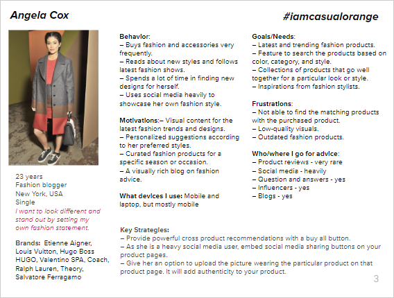
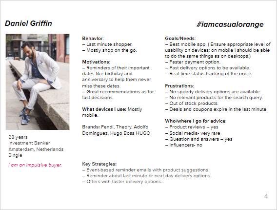
Figure 3-3: I created provisional personas for the defined segments (1-4).
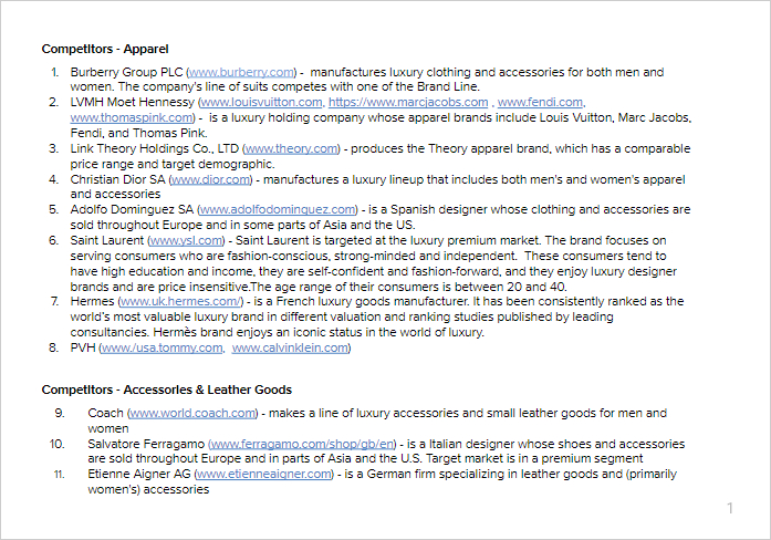
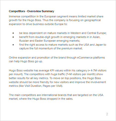
Competitive Research and Analysis
I used information collected during the brand overview, to define its close competitors. I ranged the
rivals based on the available website performance metrics (Traffic, Bounce Rate, Avr. Visit Duration,
Page Views per Visit).
Figure 3-4: Hugo Boss close competitors (1) and target market trends overview (2)
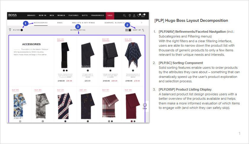
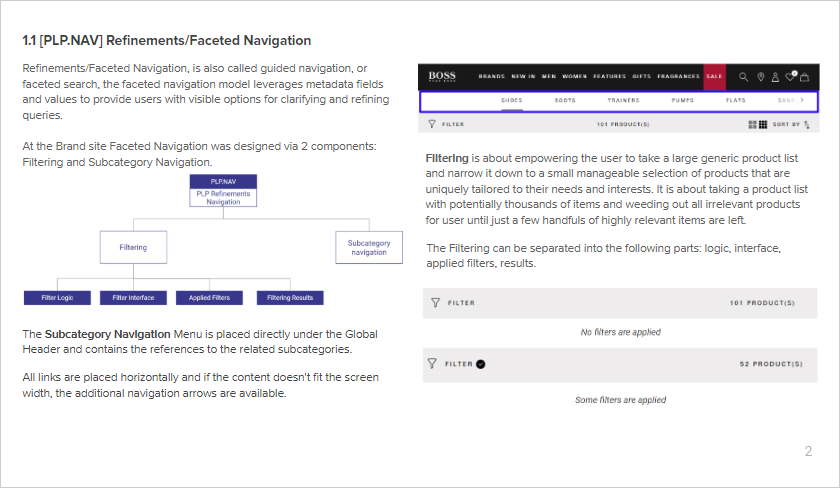
Layout Overview and Decomposition
Finally, I needed to clarify the audit scope and to figure out the layout levels and product specific
features.
To improve my knowledge about Product Listing Pages and to be aware of the subject-specific UX problems,
I studied database of best practices from recognized user researchers (Salesforce
Commerce Cloud, Baymard Institute, Nielsen Norman Group)
Then I conducted layout investigation, its decomposition and mapping to typical Work Breakdown Structure
(WBS) codes.
Figure 3-6: Existed layout study (1) and decomposition (2)
2. User Experience Audit
What Is It
User experience audit (UX Audit) is a diagnostic tool to pinpoint less-than-great areas of a site,
revealing which areas and features cause headaches for customers and reduce conversion.
The result of the analysis is the basement for making decisions and recommendation on how to enhance the
site that accomplishes both user and business objectives.
Formalised studying of web interfaces allows us to find opportunities for improvements: identify
existing and potential issues, find
bottlenecks that prevent customers from successful goals achievement.
Hence, UX Designers consider a UX Audit as a point-of-departure and source of valuable information for
the next steps of the process: prototyping, development, testing.
What Did I Do
To evaluate the audit subject from different perspectives, I used the provisional personas. I tried to
test each journey that I think real users may take while trying to accomplish their specific tasks.
As evaluation criteria, I used Information Architecture Heuristics Checklist designed by Abby Covert. To
be more specific I combined them with applicable design guidelines from recognized user researchers:
Baymard Product Lists and Filtering Report, NNGroup Report.
I took some time to design the audit report template. That helped me to communicate the findings in a
robust and comprehensive manner.
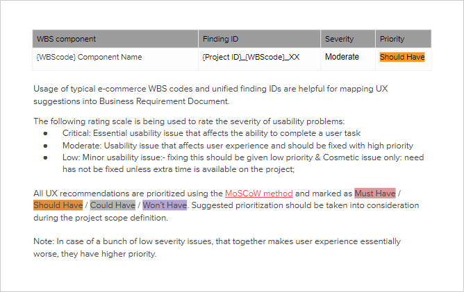
Figure 3-7: UX Audit Report: structure of evaluation and recommendations
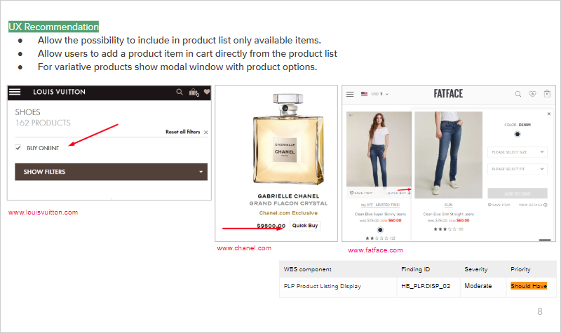
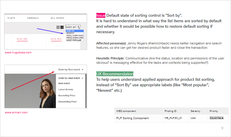
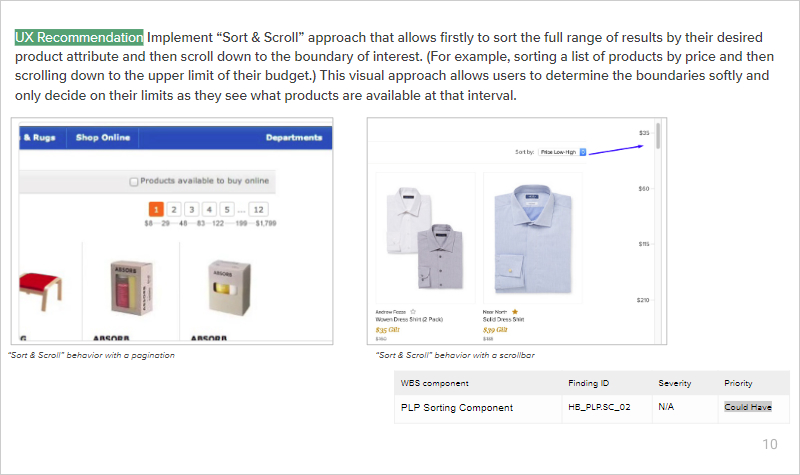
I created the UX Audit Report that includes lots of UX recommendations on how to improve user experience
through existing layouts optimizations. To reach a common understanding with stakeholders in next
stages, I evaluated UX issues’ severity and grouped all findings by priority.
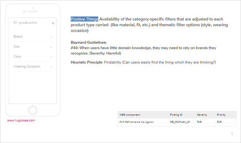
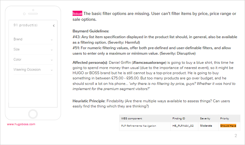
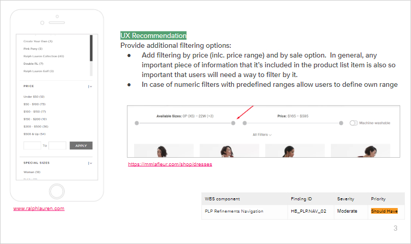
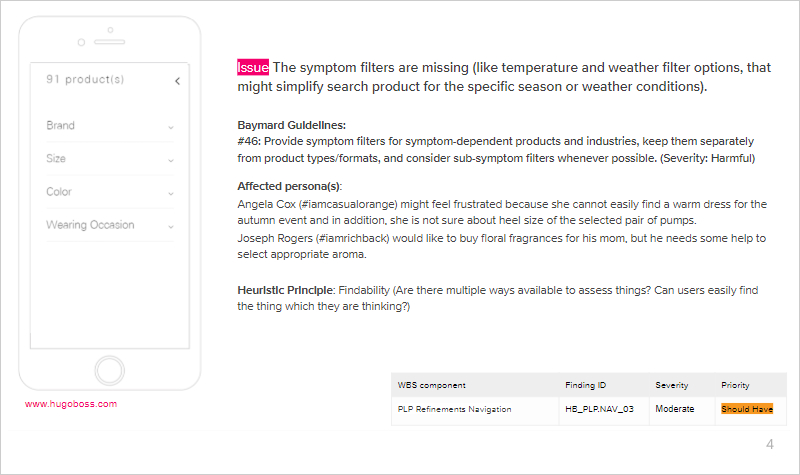
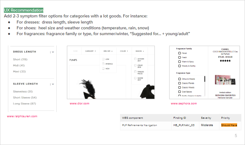
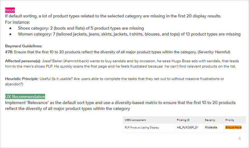
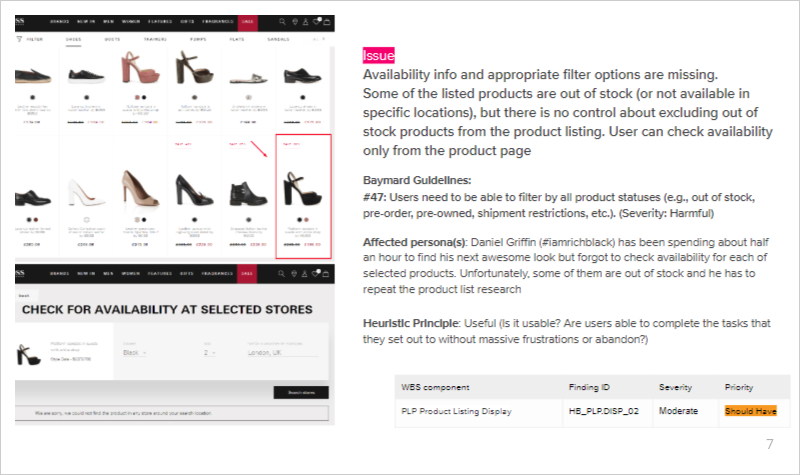
Figure 3-8: UX Audit Report: finding examples.
I listed in the report Issues and UX Recommendations, and also I highlighted positive things
that I considered during the audit.
I included illustrations, where possible and reasonable. For consistency, I was trying to use
references on rivals websites selected during the case study stage.
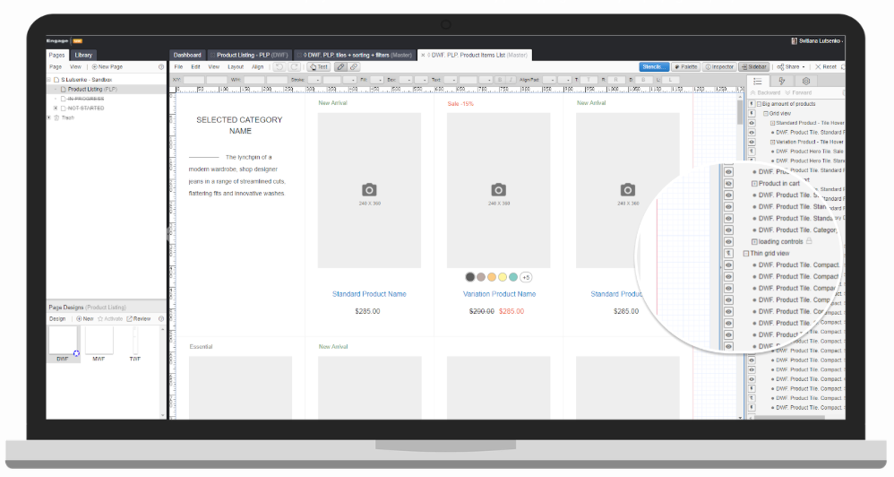
3. Interactive Prototyping
To validate, polish and visualize suggested UX improvements I created Interactive Prototypes, based on
the existing layout. In order to provide a responsive solution, the prototypes were created for desktop
and mobile breakpoints.
For creating, reviewing, and refining the interactive prototypes I used ProtoShare
tool.
I chosen that tool for the project because it used to be a main prototyping tool in my employing
company.
Figure 3-9: Prototyping process
Prototyping Fidelity and Target Screens
A prototype fidelity level depends on what we are trying to find out. There is no right or wrong
answer to the level of detail you need to add to your prototype. A quick paper sketch can be far more
effective than a highly polished mockup in the right circumstance.
For this project, I decided to create a medium-fidelity interactive prototype because it provides
enough
details to communicate a design solution to internal stakeholders and also it can be presented to
customers for review and approval.
In order to provide the responsive solution the interactive prototypes were created for desktop and
mobile breakpoints
Figure 3-10: Final prototypes for desktop (1) and mobile (2) breakpoints
04 / REFLECTION
Lessons Learned and Takeaway
1. Provisional Personas Are Better Than Nothing
It was a tradeoff between UX research best practices (that I know, support and would like to
meet) and project restrictions limitation (that so often happens on short-term projects). I
recognize that an artificial persona mainly based on assumptions isn’t ideal. Even though
provisional personas can be a helpful tool, they still have their share of potential issues.
They are not completely reliable, don’t have opinions and can’t talk back, answer questions, or
give feedback
Related: Due to detected gaps in our web analysis process and lack of useful historical data, it
was impossible to measure the real impact of implemented changes. (For example, was a blog
traffic
spike because of extra promotion or design improvements? Or, whether conversions increased due
to
performance speedup or because of other reasons).
Despite initial skepticism, I found that provisional personas are useful.
They helped me to summarize the case study findings: info about Hugo Boss user that I figured
out
from the
public sources and results of
e-commerce
shoppers analysis conducted by NNGroup.
During the user experience assessment, they allowed me to feel empathy and focus users primary
needs.
2. Solo Heuristic Evaluation Is A Feasible Solution For Some Projects
Heuristic evaluation is a way to check the site against a predetermined set of
usability guidelines thereby affording users a better experience. It
should typically be conducted by at least three usability experts.
(The benefit of having
multiple reviewers is that despite they will likely catch a lot of the same mistakes, each
of
them will probably find something the others have missed.)
If 3 usability experts can't be allocated to the project
(freelance, nonprofit or
small start-up) , the Heuristic Markup methodology can be handy. I learned about
this approach in Leah Buley's book
'The User Experience
Team of One'
and I tested how it works during the project. I am satisfied with the results.
3. UX Audit Report Should Be Understandable Without An Oral Explanation
Before this project, I didn't draw so much attention to an audit report layout. About 5 years I
was working directly with the product owners, designers, and developers on the same project.
Hence, all stakeholders had a deep understanding of the project. When it was necessary, we could
discuss and clarify audit findings and suggestions.
Therefore, initially I created the audit report in Google Docs. It became a very long document.
Based on my mentor suggestions, it was restructured and reworked in presentation form. I think that the updated version represents findings in a clear, comprehensible manner. So, results
can be shared with internal and external stakeholders without additional explanations.
I started use the developed template for client projects and received positive feedback from reviewers. It also was shared within the team as a good practice.
“Svitlana has worked in Astound Commerce as a UX designer for several projects launches.
She was responsible for resolving usability problems detected by UX audit... During the review sessions
with a client, she was able to provide a strong rationale for suggested design solutions. At the same
time, she was open to feedback and effectively handled changes requests. It is a pleasure to work with
people like Svitlana because they are so self-motivated, focused and ever willing to learn.”