Nonprofit Website Redesign
to launch a new brand identity, enhance student engagement, and turn visitors into sponsors, supporters, and followers.
Visit updated website
to launch a new brand identity, enhance student engagement, and turn visitors into sponsors, supporters, and followers.
Visit updated websiteAssociation for Sustainability Education is a nonprofit organization based in San Francisco Bay Area.
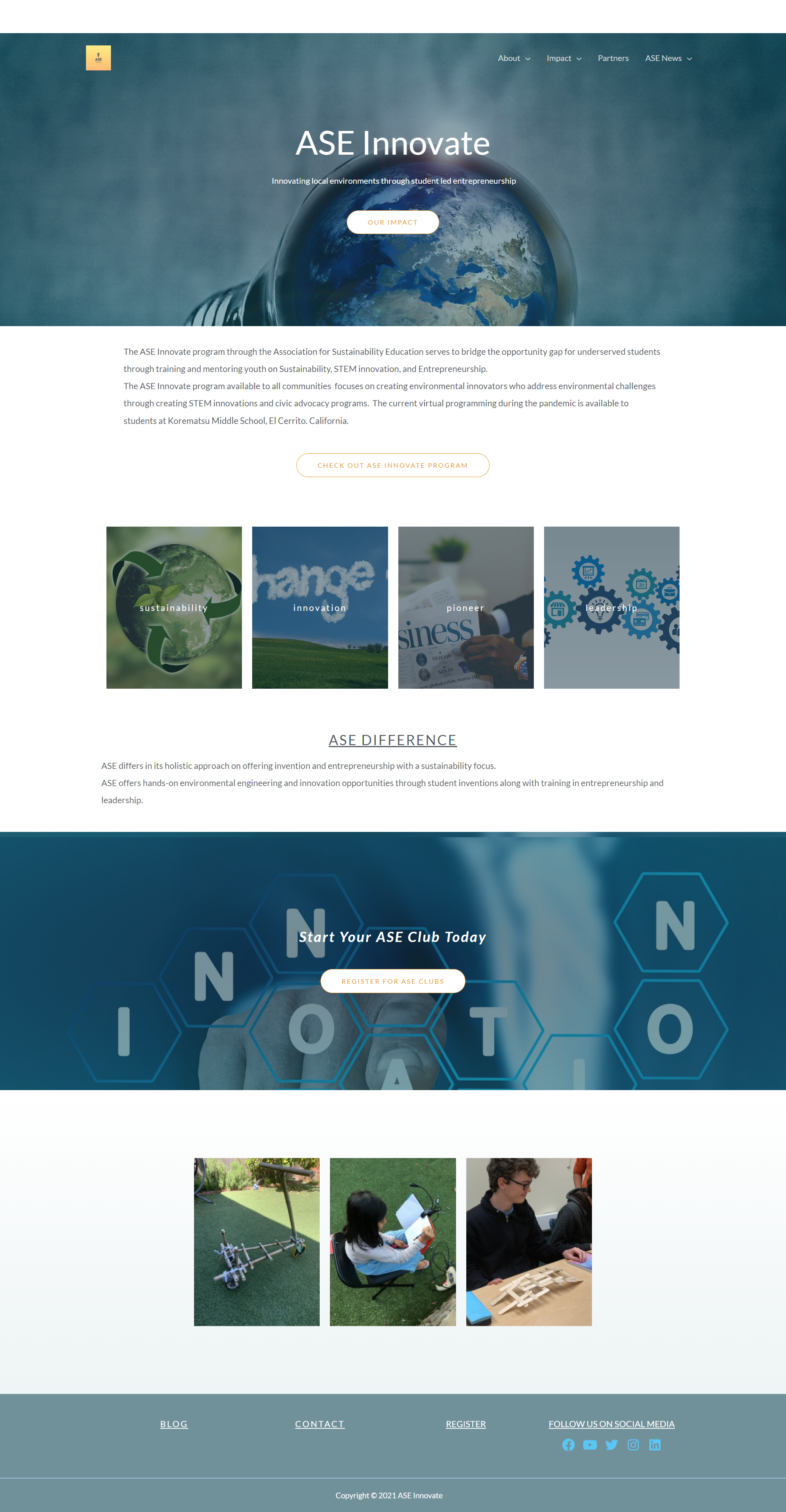
ASE Innovate is an after-school program designed to increase access to quality educational opportunities for youth (K–12) students from low-income families.
Target Audience:Young students and their parents, school members and adults from a local community (program partners and sponsors).
At the first stage, I collaborated with 8 aspiring designers from Mission College who worked creating key brand assets (logo, color scheme, typography, and business cards), home page icons, and promo materials for printing and social media.
I was responsible for the following parts:
Afterward, working with the founder independently, I did the following:
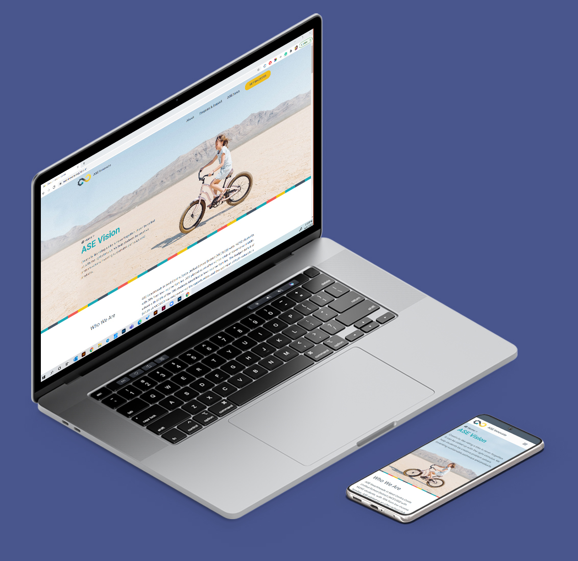
The end result is a modern, fresh new site that appeals to ASE students, is used by the founder for fundraising, and provides the local community with several clear and straightforward options for the program support.
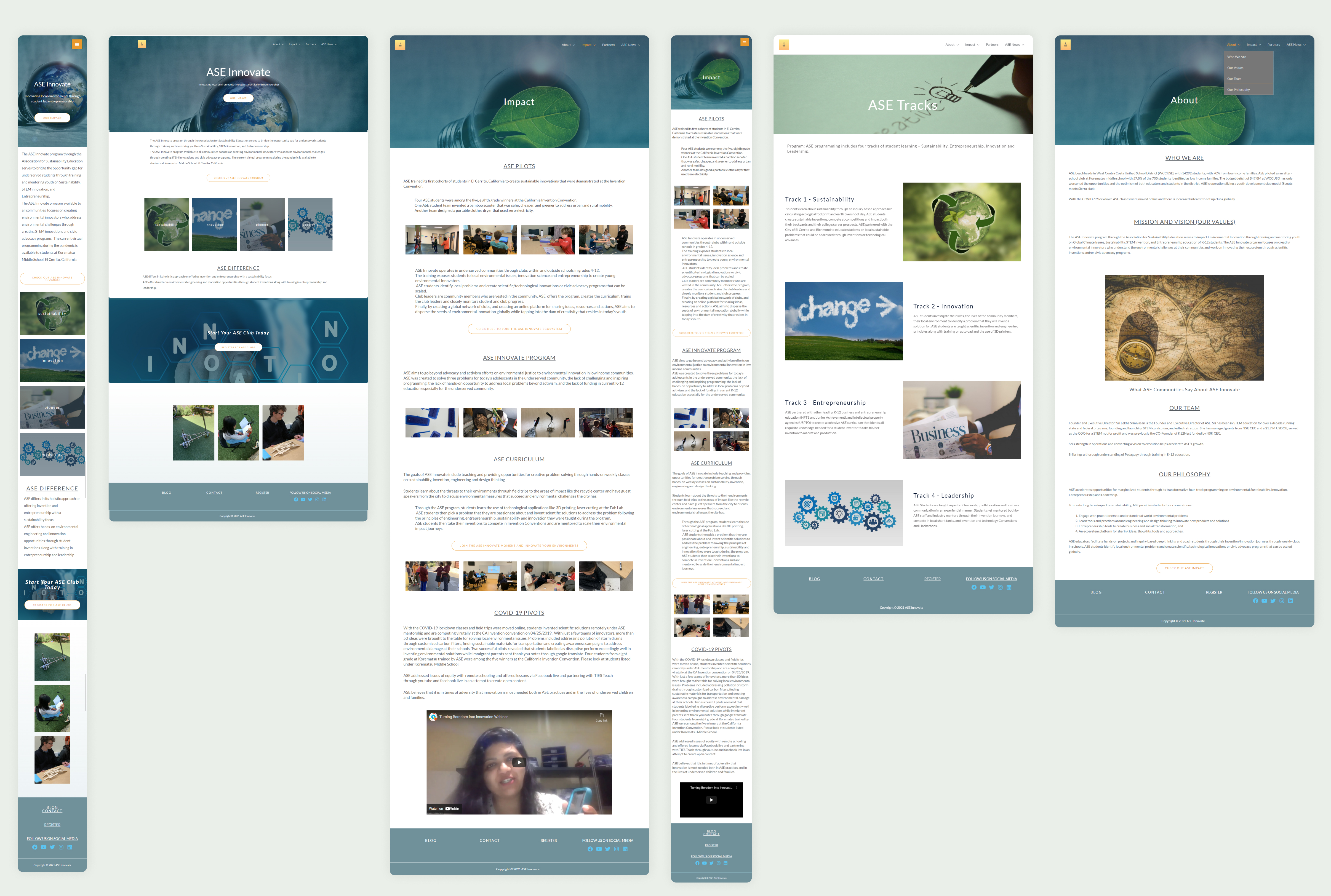
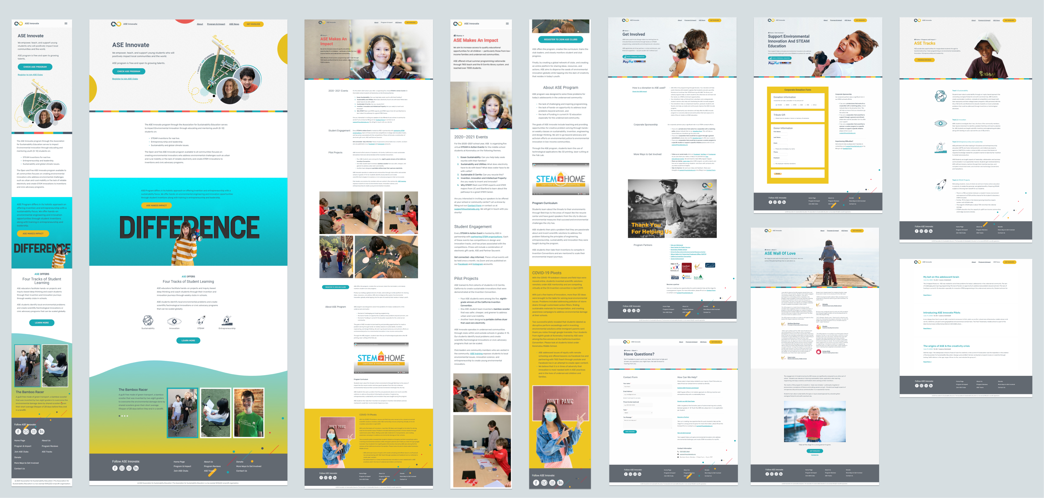
Figure 1: Website layouts before and after redesign. (Click image to open expanded view.)
Website and social media review. To gather information about the project and to prepare for the first meeting with the client, our team conducted initial review of the ASE’s website and social media accounts.
The existing website had the following weaknesses:
Founder interview. The first meeting with the founder helped us to learn more about our Client, ASE program, its target audience and stakeholders, as well as clarify founder’s needs, expectations, and project constraints.
Competitors Research and Analysis. To get inspired, understand the trends, and prepare visual references for next steps, we browsed and analyzed programs similar to ASE Innovate:
Based on the conducted research, I created a Digital Mood-Board that included key layout sections and various options on how they might be improved.
During a Zoom meeting, I presented the Mood-Board to the Client, explained UI/UX weaknesses of the existing website, and described suggesting design solutions.
This meeting helped our team understand better the client's style preferences and approve initial design directions.
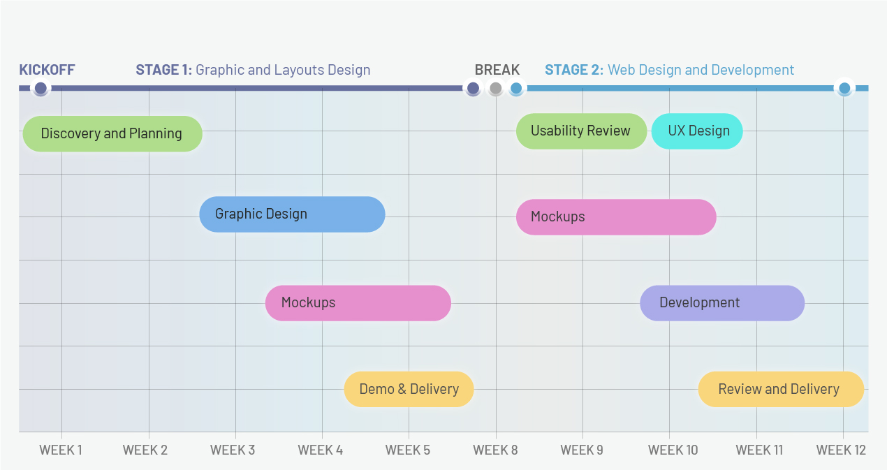
Figure 4: Key project stages and milestones.
Initial project scope. The 1st stage included design of Web Banners and Mockups for Key Landing Pages; Information Architecture rework and update of the related layout components (e.g. Header, Footer, and Mobile Menu) to improve site navigation.
Extended scope. Before moving approved designs to the production instance, to ensure visual consistency across the whole website, ASE asked my help with reworking the other pages.
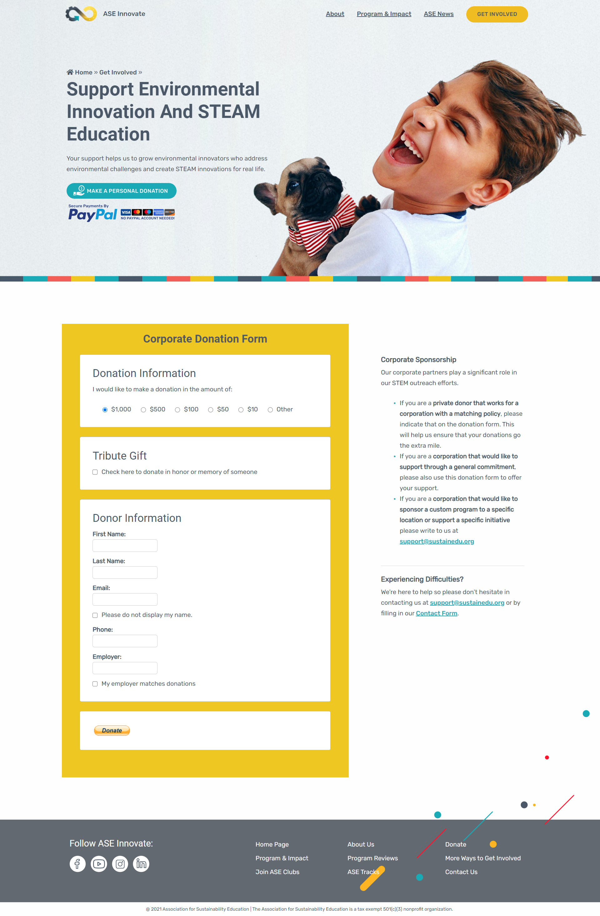
Also, I conducted a Usability Review of the contact form and analyzed key partnership flows. Based on this analysis project scope was extended with Donation Features design and Contact Form rework.
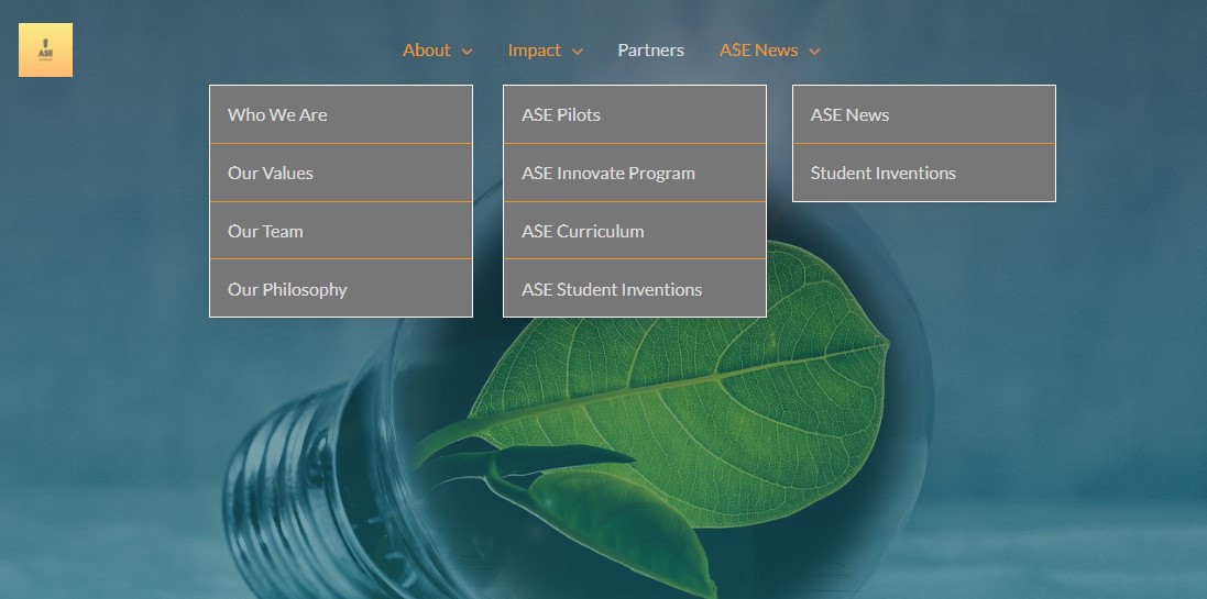
Issue #1. Barely structured header layout and overcomplicated global navigation menu:
Issue #2. Useless and messy footer with low contrast icons and needless link to the abandoned twitter account.
Design solutions to solve detected UI/UX issues:
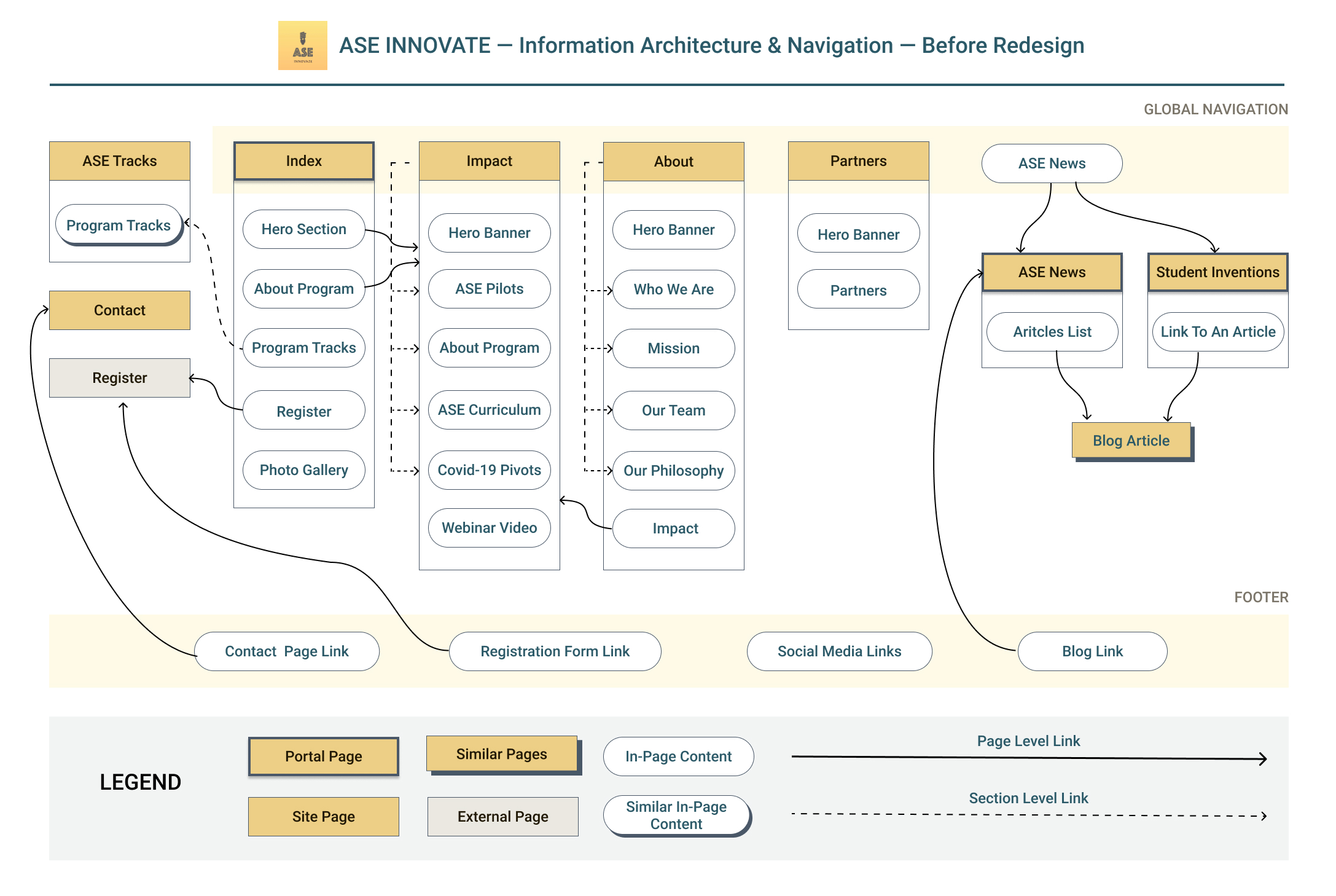
Figure 7: Information Architecture and Navigation Flows before redesign.
Issue #1. Unreasoned site structure and doubtful navigation flows.
Issue #2. Lack of cross-references between related content blocks.
Design solutions to solve detected UI/UX issues:
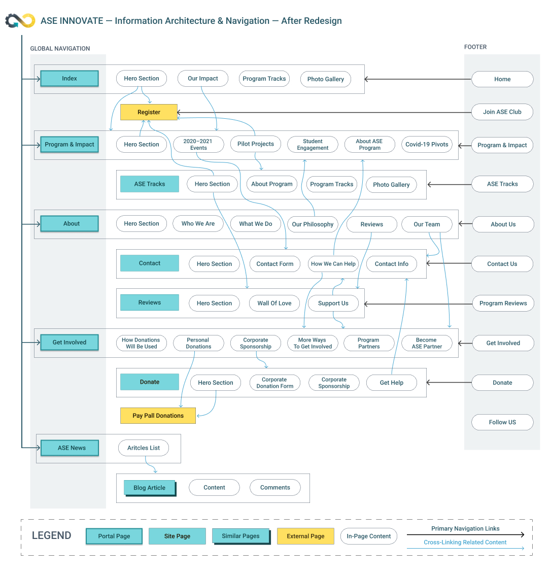
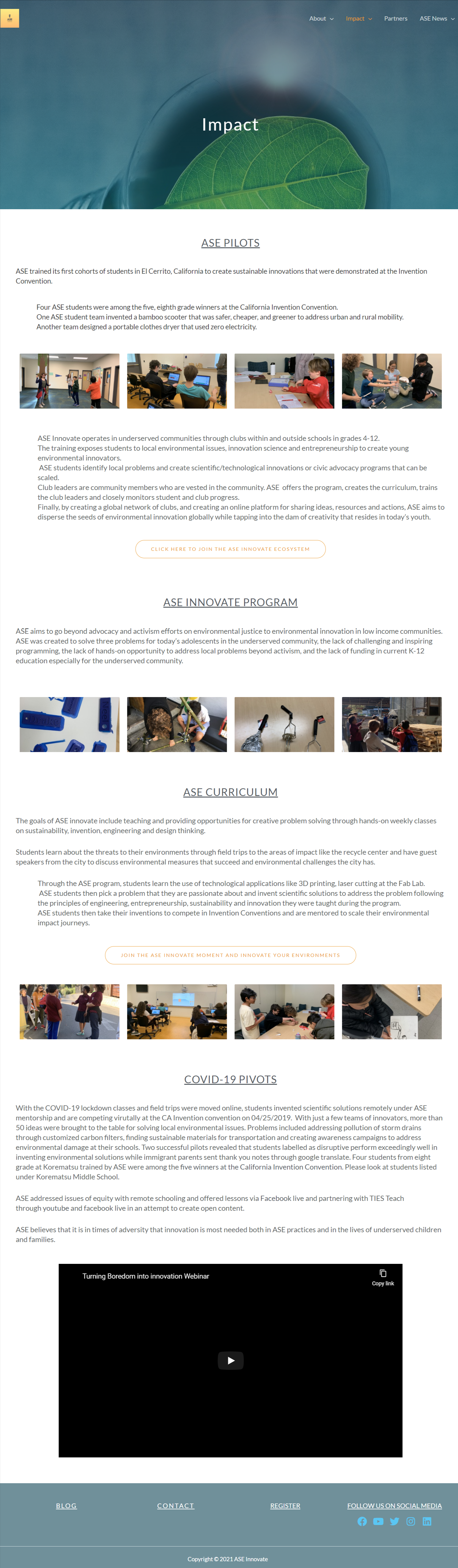
Figure 8: Information Architecture and Navigation Flows after redesign.
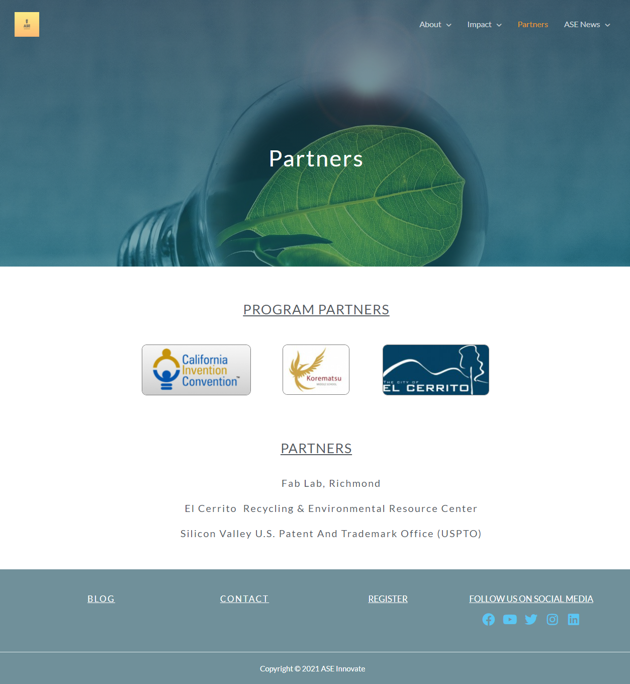
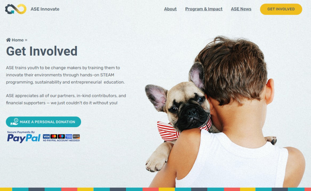
Figure 9: Partners page before redesign.
Issue #1. No information on how donations will be used or ways to help the project or support it.
Issue #2. Boring and unstructured page layout with no call-to-action.
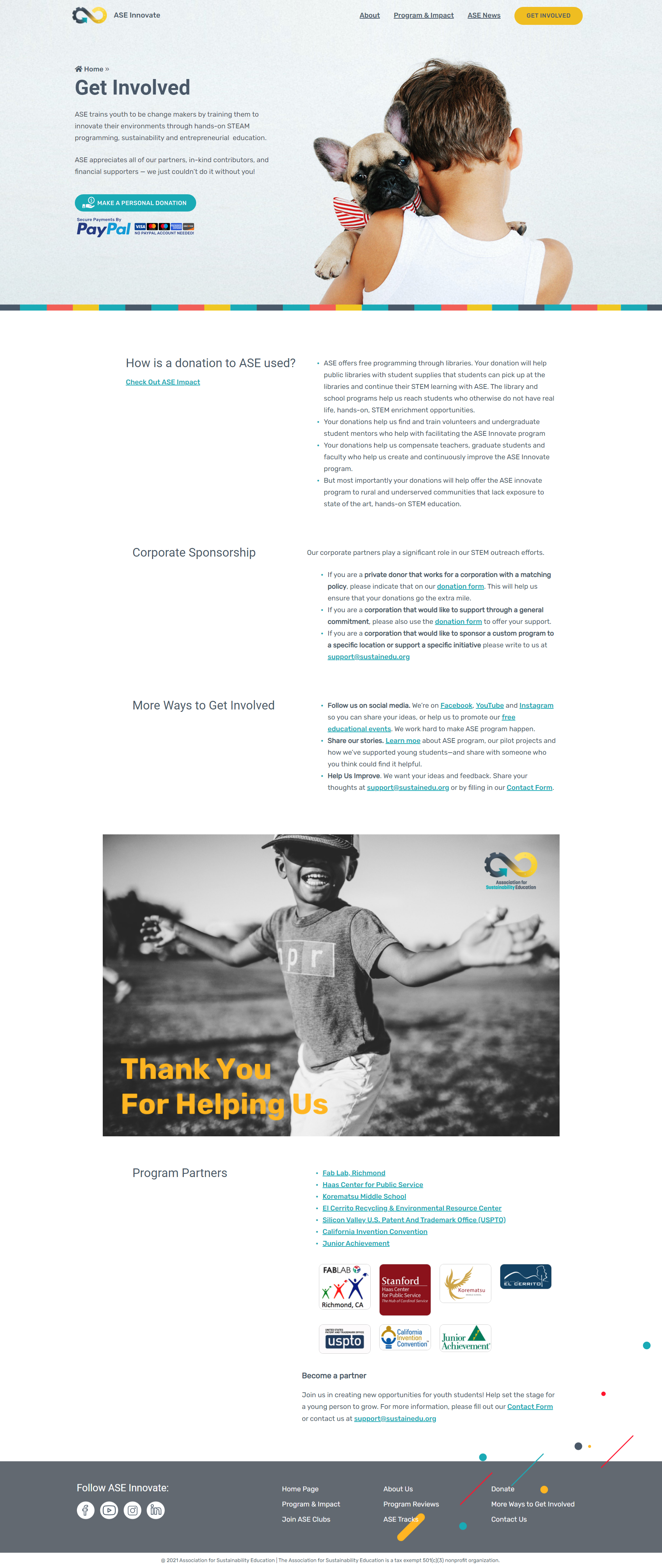
Design solutions to solve detected UI/UX issues:
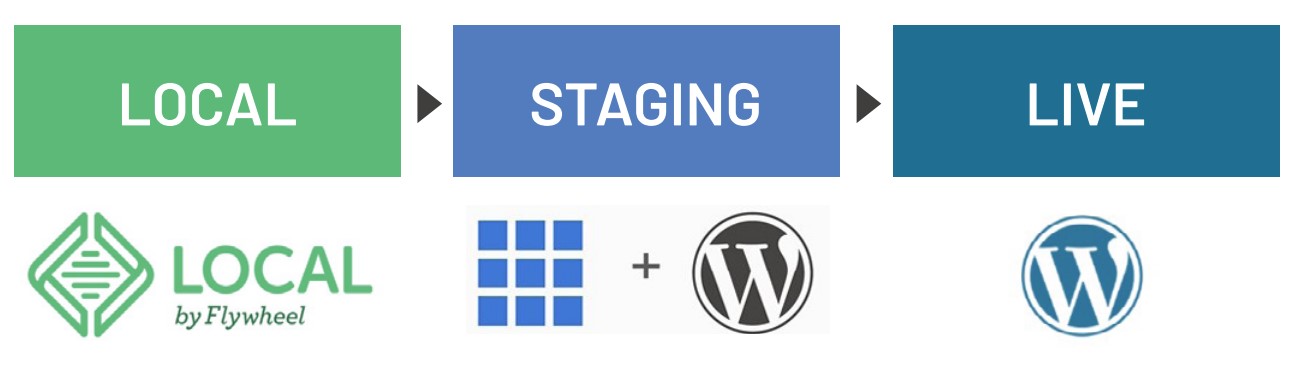
Localhost. Using Local by Flywheel I created a local development environment same to the production instance and duplicated there all content, templates, and active plugins from the existing site.
Staging. In addition, we had a staging that allowed us to test plugins, make content modifications, and conduct acceptance testing before redesign the launch.
Backups. Before each migration I did whole web-site backups and tested that I could restore the site from these backups.
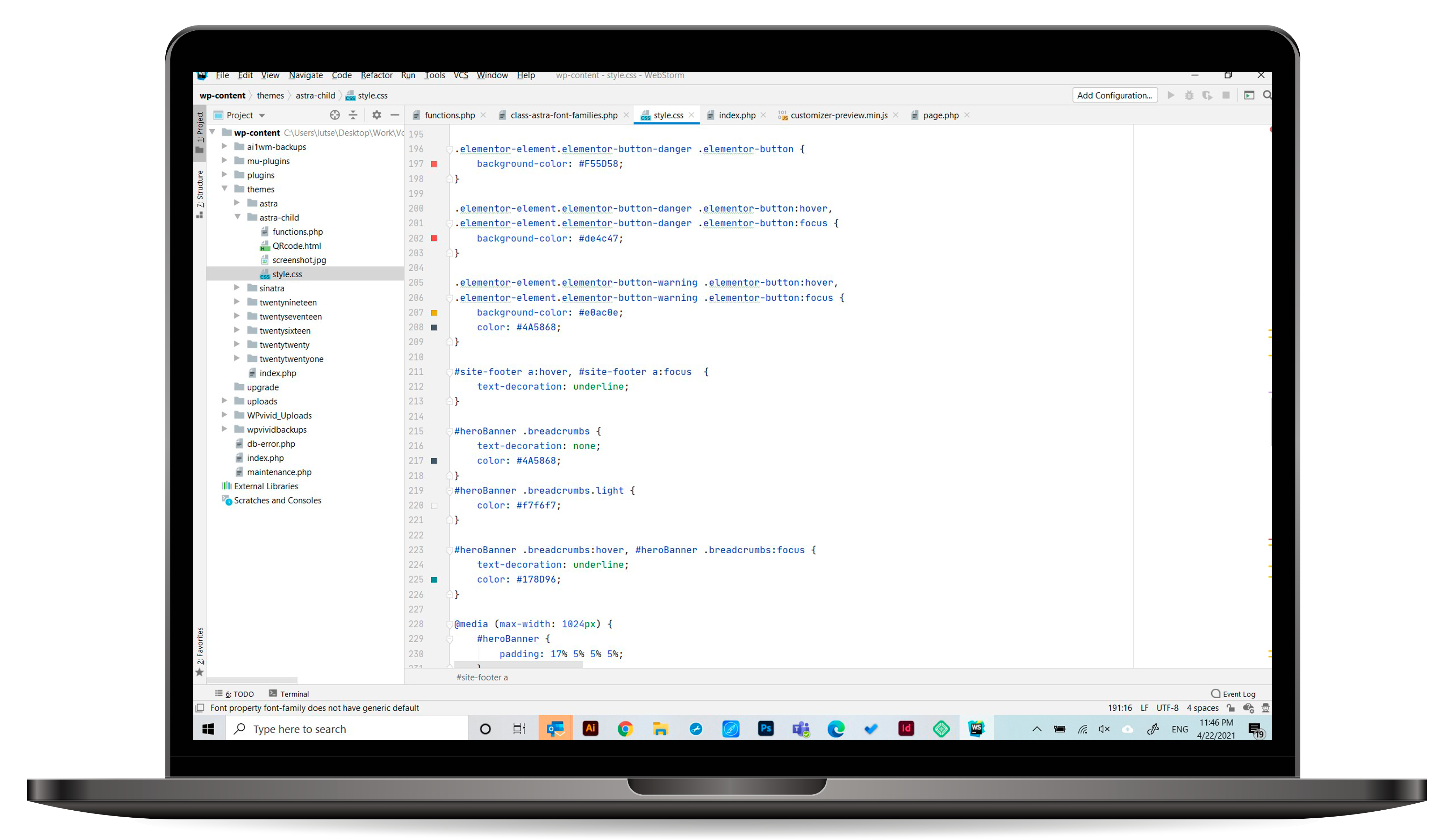
WebStorm: HTML, CSS and PHP coding for template customization and custom features (e.g. home page slider) development.
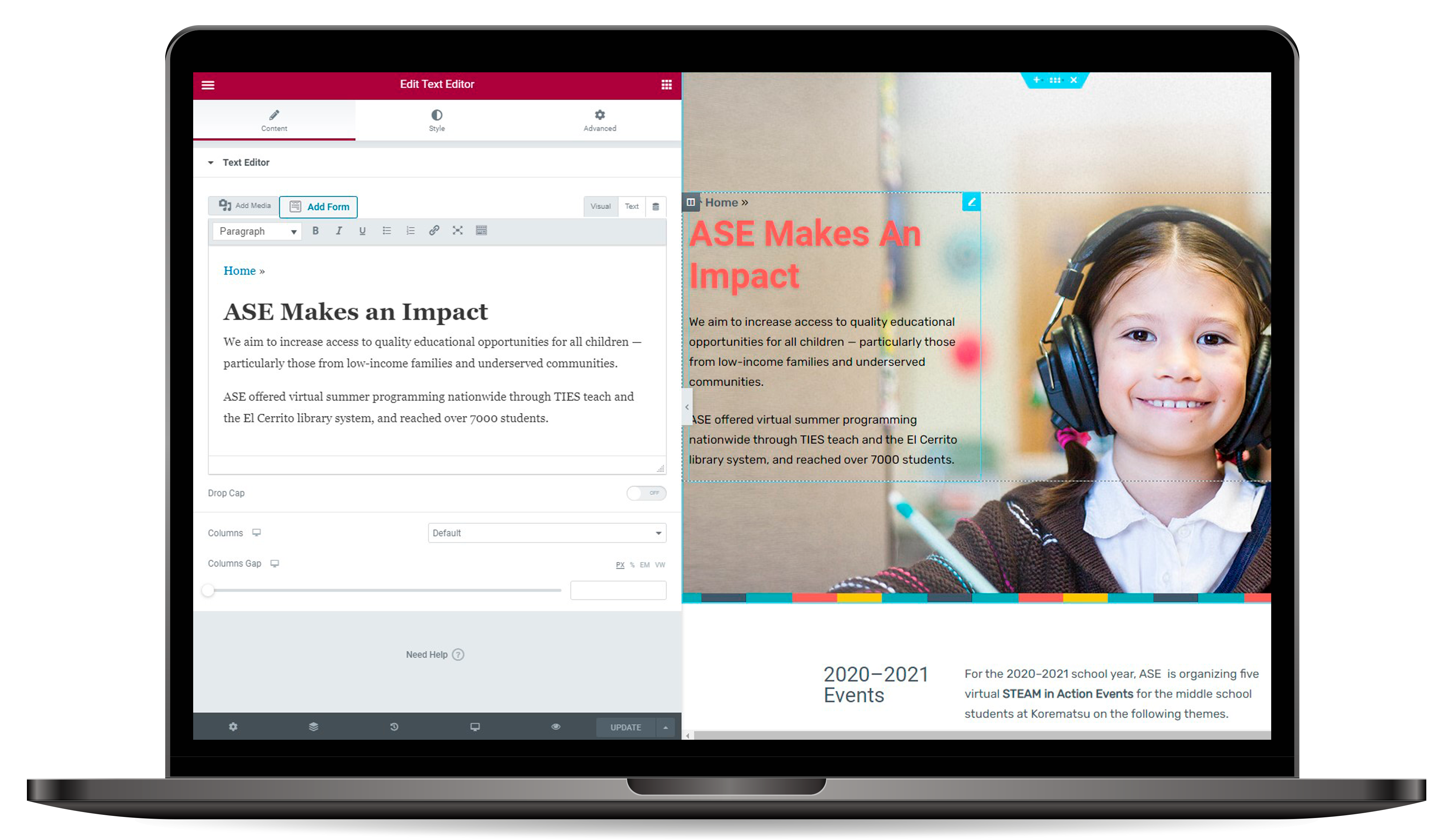
Elementor Web Builder on admin site for in-page content editing and layout adjustments.

“I got to witness first hand what a brilliant developer Svitlana is with thinking through not just the client's current needs but also the future needs in maintaining the website. Svitlana has the rare talent in blending creative design and web development, embellished by her hard work and grit. She will be an asset to any team she works with. ”
Sri Lekha Srinivasan
Founder and Executive Director, Association for Sustainability Education