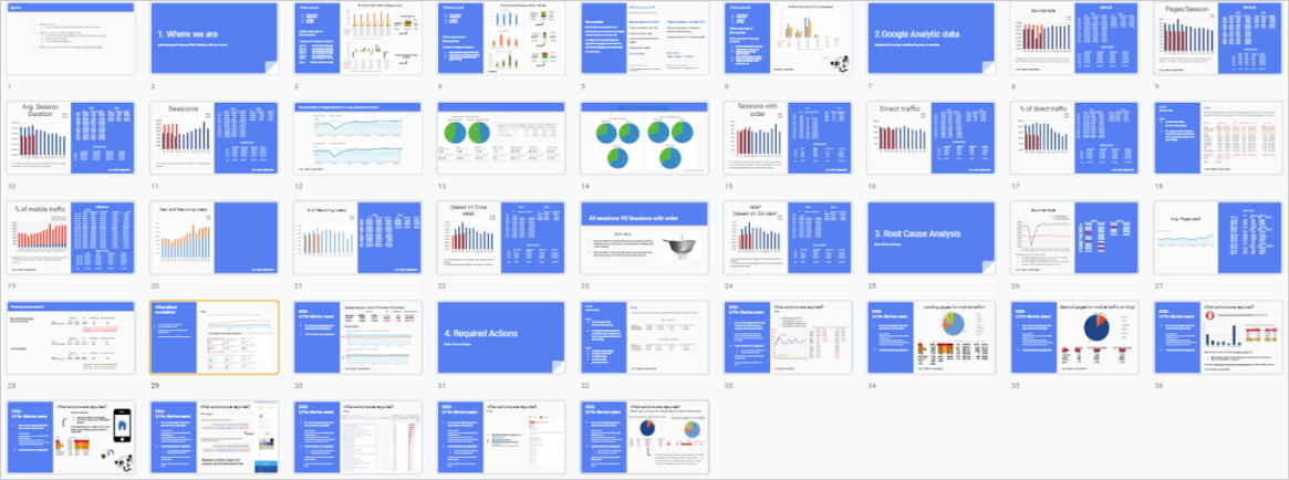
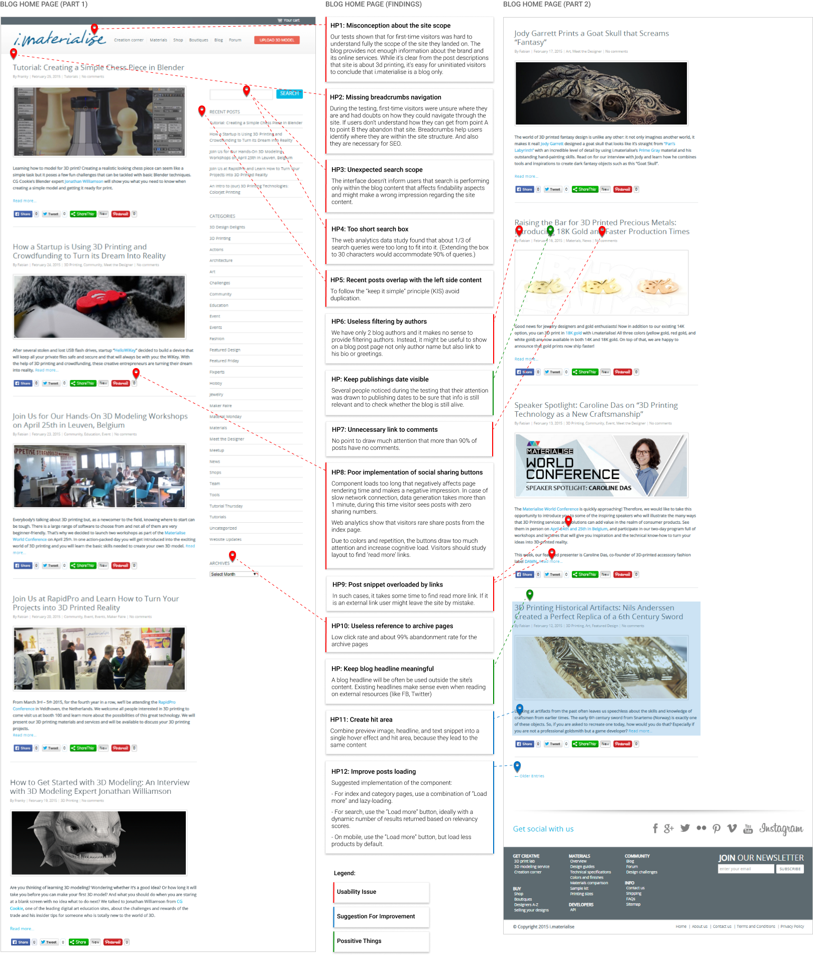
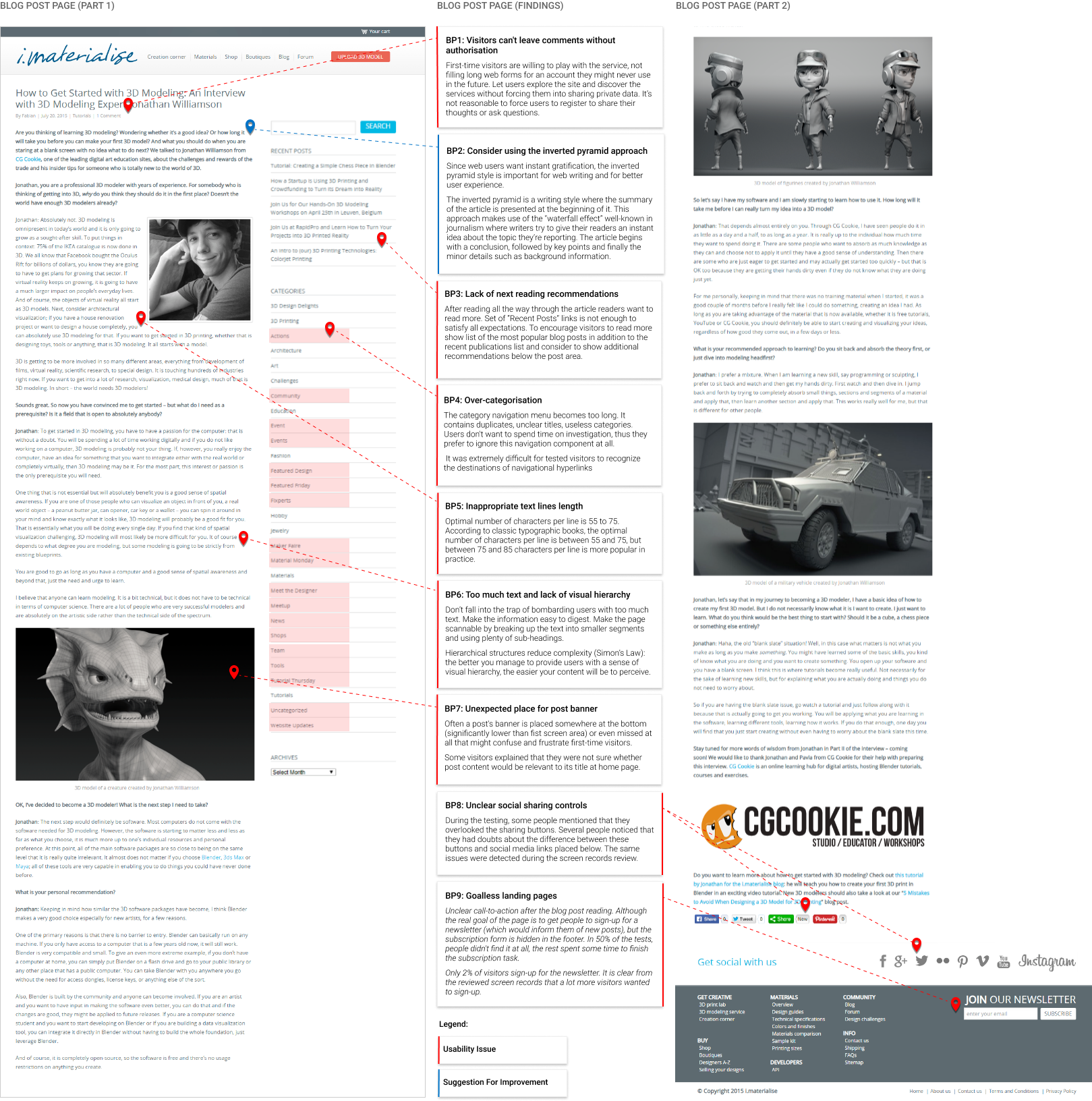
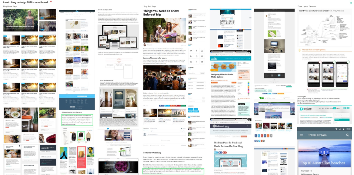
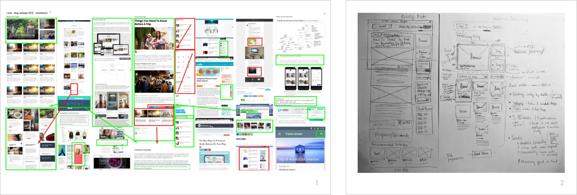
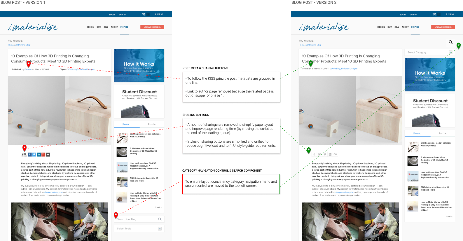
UX DESIGN, FRONT-END DEVELOPMENT — 2016

3D Prinitng Blog Redesign

UX, UI, SEO, and performance improvements to enhance user engagement, increase conversion rate, and boost organic traffic to the website.

i.materialise is an online 3d printing service, community and marketplace. This B2C solution helps customers and small entrepreneurs to design, print and sell such things as unique jewelry, decor elements, gadgets and prototypes of their creative projects.

Visit i.materilaise.com →

01 / The introduction

Materialise was my full-time employment for about 4.5 years. Working with Materialise I’ve been involved in the design and development of two world-known 3D printing services platforms: i.materialise.com and onsite.materialise.com. These platforms are designed to allow consumers and companies to upload their 3D models and order printing in more than 30 types of materials using Materialise production facilities located in Belgium, Poland, Czech and Germany.

The challenge

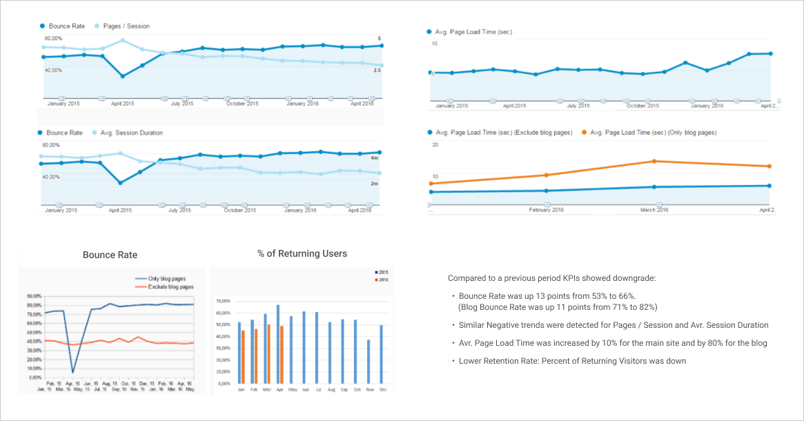
In 2016 we needed to improve the blog layout as our web KPIs showed strong negative trends. Working on this project we aimed to fix detected usability issues, refresh design (i.materialise targeted to the creative audience, hence it is the case when UI is UX) and improve mobile user experience via fast and responsive layout.

The hypothesis was that by doing so, we would increase user engagement and boost mobile traffic.

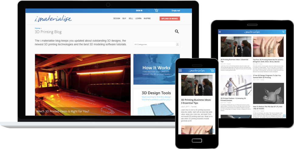
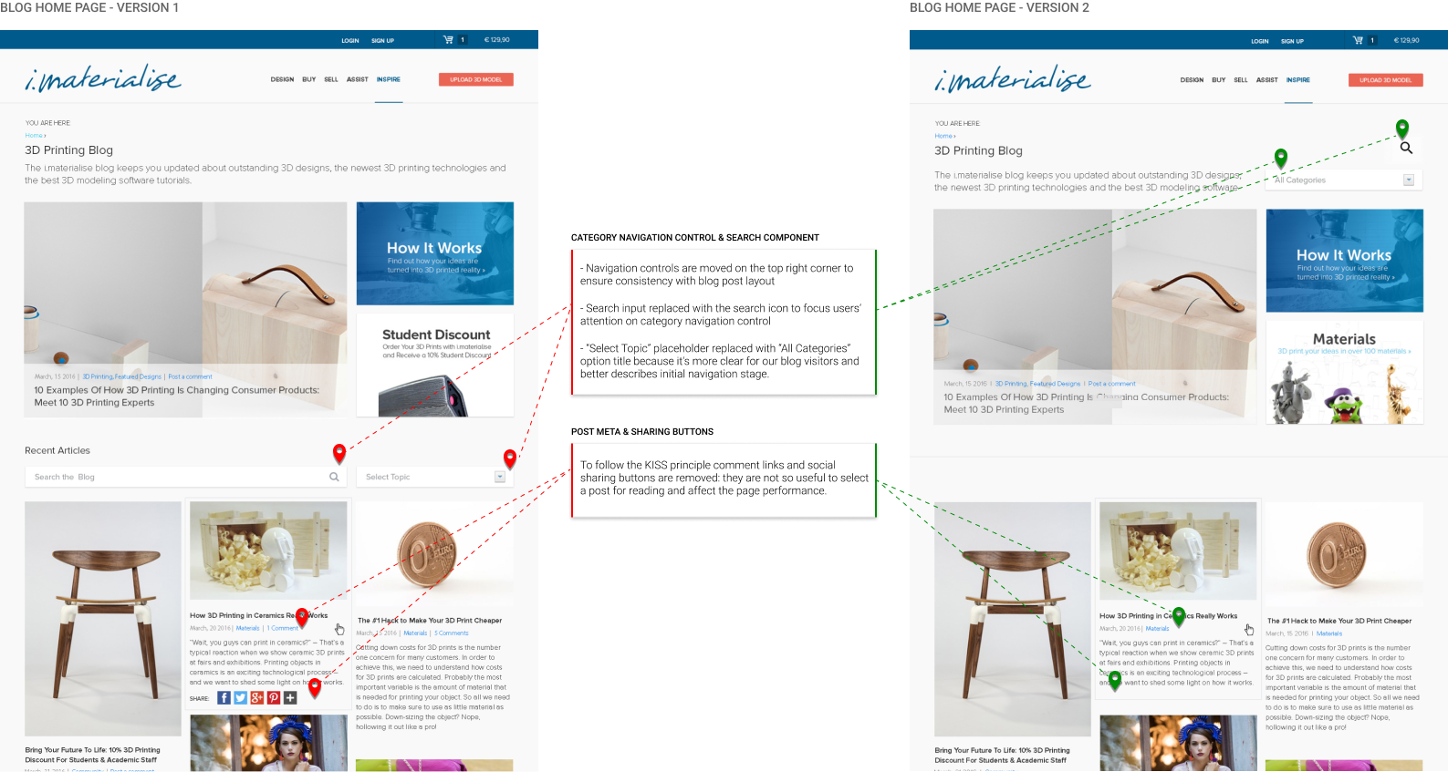
The outcome was a new responsive blog layout that allows users to get help and inspiration by browsing through blog posts and exploring the linked website content.
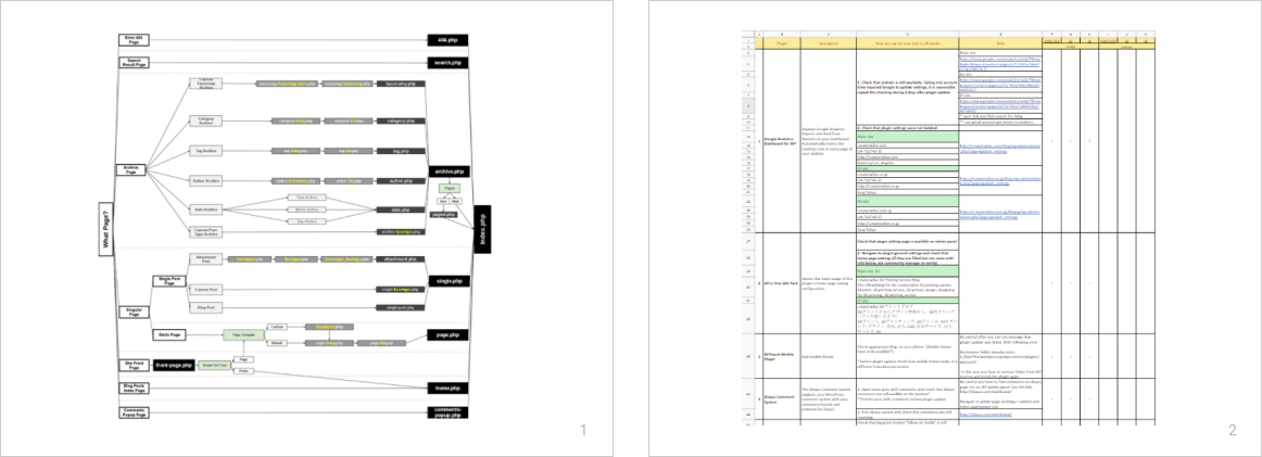
For the purpose of this case-study, I will focus predominantly on the UX optimizations we implemented for desktop layout.

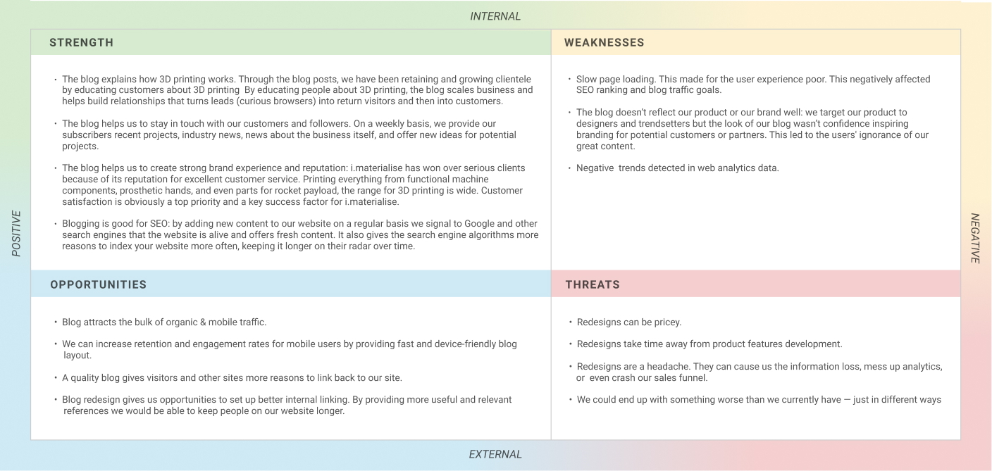
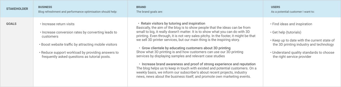
Why was it important

The blog represents an essential part of brand marketing activities:

  • By educating and engaging interested readers, 3D printing services are promoted to potential customers.
  • It attracts the bulk of organic traffic and considered as the most common entry point into the website.
  • It aims to establish brand credibility and encourage visitors to dig deeper into the conversion funnel.

That's why it’s important for i.materialise to design and keep blog layout in an easy for users to find the information (valuable 3D printing related content) and inspiration they’re looking for.

What did I do on the project

The project presented here is completed by the geographically-distributed and cross-functional i.materialise team in an agile software development environment.

I worked on it from start to end. I led problem research and saw it through to the final outcomes which included solution design, implementation in code and changes evaluation once released.

My Project Roles: UX Designer, UI Developer, and Project Manager.

Figure 1-1: i.materialise team and our work process

As a geographically-distributed team, we’ve used Scrum to collaboratively handle all i.materialise projects: sprints planning, daily meetings, sprints review and retrospectives. Every 2 weeks we deployed new features on production and got immediate feedback from our customers.

    UX Design

  • Problem research.
  • Solution design: UX gap analysis, brainstormings, solution research, wireframing, user testing.
  • Requirements elicitation sessions.
  • Mockups review.
  • Mobile layout design.
  • Work with developers to ensure the work on-brand with usability in mind.

    UI Development

  • Feasibility check.
  • Translate project requirements in user stories for development and testing.
  • WordPress template selection and customisation.
  • Front-end layout design and implementation in code.
  • WordPress plugins setup and configuration.

    Project Management

  • Project goals setup.
  • Scoping and planning sessions.
  • Features estimations.
  • Development backlog management.
  • Outcomes evaluation and reporting.
Figure 1-2: My roles and responsibilities on the presented project

As it often happens in a product team, I had a wide range of responsibilities: web-analytics, design, development and project management.

02 / The approach

1. I did web analytics to understand the current state and define opportunities for improvements. For analysis, I used Google Analytics, available competitors' data and internal marketing reports.

2. I prepared and presented a report with detected performance issues to the whole team. My suggested actions were to redesign key landing pages and to fix performance issues. The report was well received and i.materialise launched few projects to improve the site usability.

3. I gathered business needs, assumptions, constraints, the understanding of the customer's needs and high-level requirements. The inputs were translated into high-level project requirements. On later stages, requirements were clarified, itemized and converted into Project Requirements Document.

4. I conducted a UX gap analysis and suggested fixes for detected usability issues. Together with the team, we translated suggestions into high-fidelity wireframes.

6. UI Designer created mockups and together with our Community Managers simplified category navigation menu. I reviewed visual designs and conducted feasibility check where it was necessary.

7. Working together we iteratively customized selected WordPress template and moved existed blog to a new responsive layout.

8. Before the launch, all changes were tested on acceptance brunch. By acceptance testing conducted by our QA engineers, we were convinced that all requirements were appropriately translated in code and that existed blog content was successfully moved to the new blog theme.

9. In a few months after the launch, we evaluated project results based on web analytics data, gathered user feedback and results of conducted online satisfaction survey.

03 / The process

1. Understand the current stage

I conducted the site performance review to paint a picture of the current state and determine opportunities for improvements.

  • Competitors overview

    I aimed to figure out market trends and evaluate i.materialise performance against its closest competitors. For this purpose, I selected 3 rivals targeted to similar geographic markets and audience segments. Open data source (Similarweb) was used for the comparison. No issues were detected, but gathered data was included in the final report to the keep team aware of market trends.

  • Web analytics review

    I compared Key Performance Indicators (KPIs) against their values in previous periods. In web analytics, I could see issues with user session durations and related bounce rates. It was evident that landing pages despite attracting a lot of traffic, didn't encourage visitors to drive deep into the conversion funnel.

    Then, I conducted a deeper analysis of visitor segments and their behavior data. Digging into the numbers, I detected an essential drop of returning visits, poor mobile conversions and a clear correlation between page load time and bounce rate.

Hence there was a need to improve key landing pages (Blog & Home Page) and fix performance issues for the whole site. (For the purpose of this case-study, I will focus predominantly on the UX optimizations we implemented for the blog.)

Figure 3-1: Web analytics insights

It was a fist time when we decided to leverage data to inform their designs. Thus I was learning along the way too. I spent a few weeks to break things apart, to understand what data we had, how it could be used and whether we gathered it in a right way, and to plan improvements for our web-analytics process.

Figure 3-2: Web analytics report presented to i.materialise team

2. Define the goals & success criteria

The project team including key stakeholders (Product Owner, Busnes Analyst, Product Designer, Dev, FE & QA Leads Team) came together to discuss the research results and plan follow-ups.

We highlighted stakeholders and their goals to find an overlap between business goals and users' needs. We decided to launch a blog redesign to allow users to find information, answers, and inspiration through easy blog browsing. By doing so we aimed to retain visitors, boost traffic and improve user experience.

Figure 3-3: SWOT analysis outlined key areas of improvements
Figure 3-4: Project stakeholders and goals

Finally, we needed a measure of success. We desired to use actual data to measure once the redesign was out in a steady state. Unfortunately, at that time, we didn’t have enough inputs and experience to put actual numbers down, but we wanted to keep an eye out for an uplift in the following metrics:

  • Visitors engagement: revisit rate (repeating visits).
  • Visitors attraction: web site traffic from search engines.
  • Usability and satisfaction: posts sharing, average pages per visit, average visit length (median value), blog abandonment rate, users' subjective satisfaction.

3. Problem research

I had no access to real users and existed user personas were outdated. Thus, the following steps were taken to explore existed usability gaps and actionable insights to fix these issues:

  • User behavior observations

    I watched about 20 visitors sessions recorded using Hotjar. By inspecting real actions taken by visitors while browsing the blog, I was eager to discover patterns (how deep visitors scroll down blog pages, where do they click on the index page, interaction with links and buttons), how easy-to-use they could found navigation controls, and where people were hesitating or getting stuck.

    Where it was possible I used available web analytics (behavioural data) to check whether there was a pattern in user actions and generate actionable insights (for example, based on search queries length it was suggested to increase the search box width).

  • Hallway testing

    In order to study detected behavior patterns and gather additional inputs for usability assessment, I performed 5 hallway testing sessions. Talking with people while they were browsing through the blog pages, I received wide and constituent feedback.

    For instance, I detected issues with search control (unclear search scope and frustrating search results); recognised that some first-time visitors didn't fully understand the scope of the site they've landed on; validated hypothesis regarding useless navigation controls and unclear CTAs.

  • Competitors review

    Inspired by the competitors' review, I was aimed at simplicity by cutting back on unnecessary features and complexity.

  • User experience audit

    Finishing up the research phase, I evaluated user experience based on the basic rules of usability and common sense. To stay focused and avoid opinion-based decisions I used Information Architecture Heuristics Checklist designed by Abby Covert and best practices from recognized user researchers (Baymard Institute, Nielsen Norman Group).

Figure 3-6: Blog home page before redesign and list of detected usability issues

Figure 3-7: Blog post page before redesign and list of detected usability issues

4. Solution design

To figure out initial design concepts we conducted several Skype meetings with the Community Managers (who handled all activities related to blogging and had contact with some blog readers), SEO specialist (who guided Search Engine Optimizations for the i.materialise website and provided valuable suggestions for this redesign project). At this stage, I was responsible for entire concept design and feasibility check.

Before the meetings I spend a few days discovering existed blog features and layout structure, summarising research results and preparing the following inputs for team brainstorming sessions:

  • Digital Mood Board
  • Blog Features Mindmap
  • Blog Plugins Spreadsheet
    For performance optimization reasons it was required to review and clarify the necessity of blog 3rd party components and extensions.

This is why it was important for i.materialise to design and keep blog layout in a way that’s easy for users to find the information (valuable 3d printing related content) and inspiration they’re looking for.

Figure 3-8: Digital Mood Board was used for references

For our distributed team an online format was the only possible option. It was only for internal needs I didn't want to spend extra time for a fancy layout. I moved appropriate research artifacts in Notion.so and shared this page within teammates.

Figure 3-9: Additional brainstorming inputs: Blog Features Mindmap (1) and Blog Plugins Spreadsheet (2)

I listed and described all active plugins. Initially, we used this inventory spreadsheet to allocate ownership and to remove/deactivate unnecessary plugins. Later we decided to keep it up-to-date for ongoing blog maintenance.

Since we needed to work with existing website elements, we decided to break things up into modules, prioritise them and sketch out ideas for each one and how they might be laid out on the page. We also came up with ideas for some simple new elements to improve the page.

I used the mood board and paper prototypes to easier convey research results, team ideas and my suggestions on how we could fix existed UX issues.

Figure 3-10: Brainstorming artifacts: quick digital notes on shared screenshots (1), first paper prototypes with hands written comments (2)

I use different approaches to make records during remote sessions. It helps me to stay involved in the discussion and keep records without speaker interruptions.

5. Project requirements definition

Based on agreed solutions and paper sketches, I wire-framed key blog pages showing necessary details: layouts structure and visual hierarchy, components and their design.

Despite longer time required to make high­fidelity wireframes, I had the following reasons to deep into details:

  • Review and approval simplification. High-fidelity wireframes require less imagination from the stakeholders, and thus, make it easier for them to approve or disapprove of features.

  • Feasibility check and requirements clarification. To boost development we wanted to select and buy readymade WordPress template and then just customize it in accordance with the approved design. To define the necessary criteria for template evaluation and purchasing, stakeholders should have a pretty good vision of how the platform will look and feel, without getting into the visual design stage.

  • Design activities synchronization. It was necessary to align the changes with other ongoing projects before going through the entire software development lifecycle (SDLC).

Figure 3-11: Suggested changes and high-fidelity wireframes

Scope and implementation requirements of necessary UX improvements have emerged clearly during the wireframing stage.

In parallel with wireframing, I was working on requirements preparation. The aim was to cover not only happy path but also edge cases (like blank states, one or few items in a list, missing images, error pages, the various text length for localization support and etc.).

Functional requirements, technical constraints and other applicable non-functional requirements were included in the Project Requirements Document.

Before the start of technical research and implementation in code, prepared design outputs were reviewed and approved by key project stakeholders: BE, QA, FE Leads, Product Designer, Product Owner and BA.

Figure 3-12: Project Requirements Document (initial version snapshot)

The document included functional requirements for the layout components and non-functional requirements (for instance: localization possibility, performance optimization actions, devices and browsers support, testability, maintainability, data integrity and so on).

6. Technical implementation

I selected a WordPress theme based upon planned changes. My initial research was focused on how they meet with applicable project requirements: customizability for designed layout, responsiveness, simplicity, performance, SEO, technical support availability (frequency of updates, support requests handling, bug fixing).

Figure 3-14: Requirements traceability: applicable functional and non-functional requirements were used as criteria for the WordPress theme selection (open the document).

Based on wireframes and project requirements, our product designer created mockups for the first phase. I was responsible for UI designs review: feasibility check, requirements traceability, UX review of changes required due to the project scope update.

During the development planning, product owner requested to change project scope in order to allocate resources for projects added to the product backlog. We had to divide the blog redesign into two phases. The problem was that for implementation of high-priority features (like search subsystem update) we needed to spend more time than we had for phase 1. Therefore, we decided to focus on quick fixes instead of suspending the work.

Home page updates

Blog post page updates

Figure 3-15: Design iterations of home page and blog post layouts (open full size preview)

Designs were updated due to changed project scope and UI guidelines revision.

7. Solution testing

We considered A/B testing as not applicable due to the amount of implemented changes. Therefore, the following tests were conducted to validate the design outcomes:

  • Iterative testing of coded prototypes against project requirements.
  • Corridor testing with a parallel discussion of the interaction process. Thus we were convinced that existed usability findings were resolved and there were no gaps in new features.
  • Acceptance testing of the whole solution before release. Here we checked the possibility to pass through key user scenarios, some edge cases and errors handling.

04 / The outcomes

The outcome was a new blog layout which was fully responsive and allowed users to get help and inspiration by browsing through blog posts and linked content at the product web site.

9. Results evaluation

Our analytics metrics showed noticeable improvements:

  • Better conversion rate.
    • The redesign produced a 31% blog conversion rate increase.
  • Better SEO ranking and increased income traffic.
    • Search engine rankings was up by an average of 2 positions.
    • Incoming mobile traffic was up 16%.
    • Incoming desktop traffic was up 3%.
  • Increased retention and engagement metrics.
    • Revisit percentage rate was up on 16%.
    • Average amount of pages viewed per visit for returning visitors was up on 9%.
    • Posts sharing was up on 37%

Due to detected gaps in our web analysis process and the lack of useful historical data, it was impossible to measure the real impact of implemented changes. (For example, was a blog traffic spike because of extra promotion or design improvements? Or, whether conversions increased due to performance speedup or because of other reasons).

Thus, in addition to key KPIs analysis, we measured customers' satisfaction via online surveys and gathered user feedback within face-to-face meetings.

“Sveta brought our product on a higher level on several different areas. Her neverending eager to improve the product, perseverance to keep up with and apply new technologies gave us an advantage upon our competitors. As a person, she is by nature optimistic, inquisitive, open for the opinion of her colleagues, always available for a constructive discussion and pass on her knowledge. If she would decide to return, I will hire her again immediately. ”

Wim Verstraeten
Product Manager Online Ordering Systems
i.materialise and OnSite at Materialise

See more feedback at LinkedIn