Customer Experience Assessment, Wireframing — 2019

Product Search Optimization

The project goal was to provide improvements for Home Depot's product search.
I needed to come up with a high-level user flow and supporting wireframes.

Wireframing is a way to design a website service at the structural level. A wireframe is commonly used to lay out content and functionality on a page which takes into account user needs and user journeys. Wireframes are used early in the development process to establish the basic structure of a page before visual design and content is added.

See this project in Figma

01 / The introduction

This is a demo project aimed to demonstrate my design approach to user-centered product optimizations. It took me 4 days.

The brief

Conduct user experience evaluation of Home Depot's product search subsystem—and provide solutions on how to make it better.

  • Industry / Brand: E-Commerce / Home Depot.
  • Scope: Search Subsystem (SSS).
  • Services: UX Assessment and Wireframing.
  • Deliverables: User Needs Map, Customer Experience Journey, Search Subsystem Decomposition & Review, Supporting Wireframes.
  • Target Screens: Desktop.

If they can’t find it, they can’t buy it.

Stakes of e-commerce search are exceptionally high: if users can’t find the product they’re searching for, they can’t buy it. This not only leads to lost sales here and now, but it also makes users less likely to return in the future as they obviously won’t go to a store they don’t expect to carry the product they are looking for.

Search interface and behind logic need to ensure users' ability to find relevant products. But in accordance with the Baymard Institute usability study, even multi-million dollar sites had so poor support that 31% of all product finding tasks ended in vain when the test subjects tried using search.

02 / The approach

1. Understand → 2. Define → 3. Design

03 / The process

Day 1: Understand

Raising Awareness and Gathering Inputs

I started my work from the investigation of public information: the brand history, product categories, target markets, audience segmentation and interaction channels.

Figure 3-1: Brand overview snapshot.

Figure 3-2: "One Home Depot" strategy.

The “One Home Depot” concept aims to create the near-seamless integration of online shopping channels with the in-person store experience. The goal is to merge these two shopping models in a complementary flow. (In fact, Home Depot wants to build the platform, which is a similar concept to the Services Platform its rival Lowe’s worked on in the late 2000s.)

In addition, new digital tools are being created to enhance the consumer experience. These tools include augmented reality (AR) mobile apps to see how Home Depot products might look in customer homes. These also include buying guides, know-how instructions, and expert advice for a number of customer needs. Such tools are very appealing to millennials who represent a growing home improvement consumer segment of today and tomorrow.

Days 2-3: Define

Target Audience and Needs

One of the key things a solution designer need to understand when on a project is what problem(s) need to get solved.

That means you should know your users, and understand their specifics and needs. Therefore I started problem research from the definition of high-level needs for the defined key customer segments.

Figure 3-3: Home Depot's customers segmentation, their specific and needs.

Guerrilla Testing

Guerrilla testing is one of the simplest and cheapest form of user testing. Using guerrilla testing usually means going outside to ask people there about your product or prototype. It can be conducted anywhere ex- cafe, library, train station etc, essentially anywhere where you can find a relevant audience.

I conducted a few moderated think-aloud usability studies with my friends. To finish this project in time, I focused my case study on desktop visits, most of the findings are applicable to the mobile user experience as well.

I investigated what users expect as they perform product searches on Home Depot's web site, their search strategies, what typically goes wrong in the process, why it goes wrong, and exactly what changes it will take to avoid these issues.

Figure 3-4: User testing results summarizing

I aimed to figure out what optimizations are necessary to provide a high-performing and delightful search experience for Home Depot customers.

Customer Journey Map

I created a Customer Journey Map for the selected user segment: Do-It-Yourself buyers. It helped me to summarise the user study insights, and to figure out optimizations are necessary to ensure users' ability to find relevant products.

Figure 3-5: DYI's: Customer Journey Map

Customer journey maps focus on users' needs and emotions they get as they move from one journey stage to another.

Key Search Strategies

Then I needed to define key search strategies, search subsystem elements and search logic necessary for this particular e-store.

I didn't ask people to search using the global header search form. Thus, they were completely free to choose whatever search strategy they wanted (including category navigation, search engines and venturing off-site). A large portion of them consistently used site search subsystem as a primary product finding strategy.

Figure 3-6: Home Depot customers' search strategies overview

I focused my next efforts on the e-store Search Subsystem (1.1.a) because it is primary product finding strategy.

Heuristic Evaluation

Heuristic Evaluation is a detailed analysis of a product or its components that highlights good and bad design practices in existing implementation. It helps UX designers learn the current state of the subject in terms of usability, accessibility, and effectiveness of the experience.

I analyzed the Home Depot's Search Subsystem using best practices from Baymard Institute research, good solutions that I noticed during the competitors review, guerrilla testing, own experience and brand understanding.

Figure 3-7: Decomposition and review of Home Depot's Search Subsystem

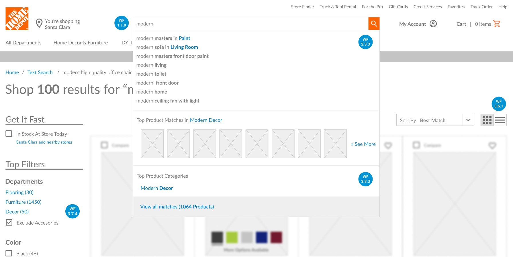
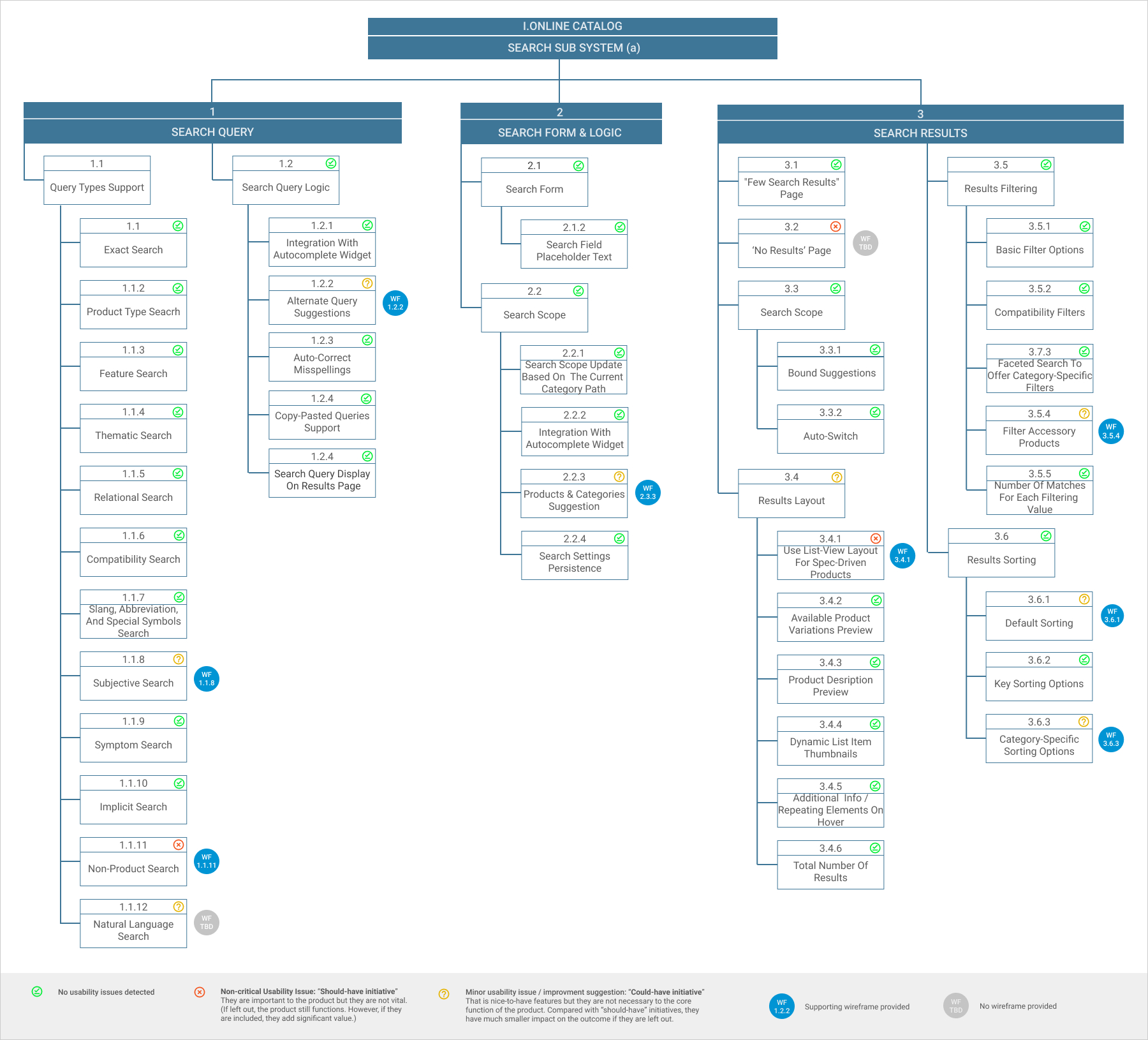
Detected Usability Issues and UX Recommendations

1) Some users expect search to include all content on the site – not just products but also auxiliary content such as help pages and store information.

  • Ensure support “Non-Product” searches by including auxiliary content in the search results. (WF1.1.1)
  • Show available guides/tutorials relevant to the search query in a separate section placed below search results section. (WF3.4)

2) Users often inject subjective components (quality, beauty, value, etc.) into their search queries that require the search engine to go beyond accuracy and venture into interpretation and opinion.

  • Consider supporting of “subjective” queries support. (WF1.1.8)

3) Some users write search queries the way they would explain them to someone else (i.e., as a full spoken sentence), yet many search engines have difficulties interpreting these natural language queries.

  • Consider supporting of “natural language” search queries, which allow users to submit questions or requests in regular “spoken” language. (NWF)

4) Sorting site-wide search results often leads to highly irrelevant results ranking first.

  • Allow users to modify product lists and search results by providing category-specific sorting attributes where applicable. (WF3.6.1)

5) Accessory products often pollute search results and render price sorting useless.

  • Make sure accessory products can be excluded from, and possibly also singled out, in the search results by a separate accessory scope filter. (WF3.5.4)

6) The layout of the search results can severely limit the user if not properly matched with the product type (list-view vs. grid-view).

  • Use a list-view layout for spec-driven products, and generally use a grid-view layout for visually-driven products. As Home Depot has mixed product catalogs, it requires both views and a way to intelligently switch to the most appropriate view type based on the user’s search query. (WF3.4.1)

7) Existed “no results” search page is unhelpful. It does not guide the user back on track as it contains an only category navigation menu.

  • Make it easy for the user to recover from a “no results” page by leveraging a combination of the following supporting elements: search query tips, category suggestions, alternate queries, contextual ads based on the user’s search query, product recommendations based on the user’s browsing history and shopping behavior, call center phone number, and list of popular products or categories. (NWF)

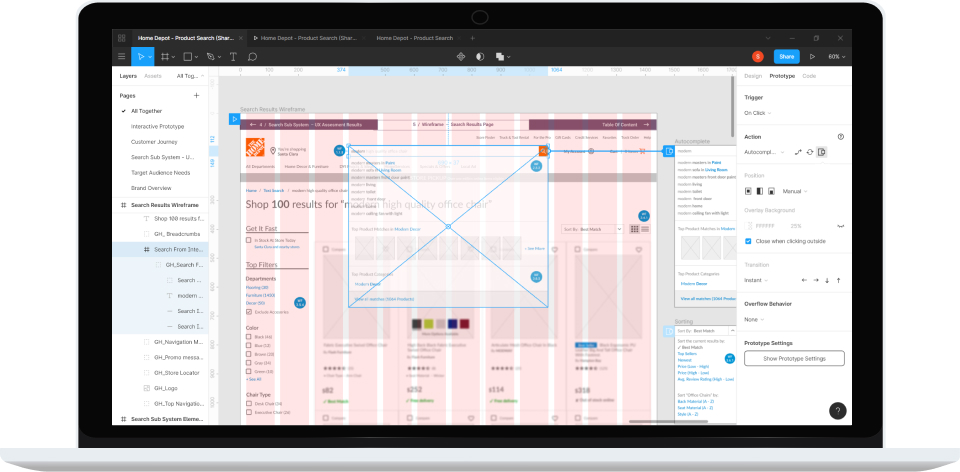
Day 4: Solution Design

To communicate suggested UX optimizations I created medium-fidelity prototype for a search results page layout and related interactions.

Figure 3-8: Prototyping process

A medium-fidelity prototype means a prototype with limited functionality but clickable areas which presents the interactions and navigation possibilities of an application.

View Project in Figma

04 / REFLECTION

When e-commerce search works, it can feel almost magical: you simply type in what you’re looking for and it is served up in mere milliseconds. It’s fast, convenient, and super-efficient. But unfortunately, e-commerce search all too often doesn’t work that well.

  • The backbone of delivering a good search experience is the search engine’s ability to understand the user’s query and deliver the best matching products.
  • To provide better results and improve users' experience search subsystem should support additional search query types, like subjective and non-product search queries. They typically require an intelligent search engine that doesn’t solely rely on basic keyword matching.
  • Proper design of the search field, autocomplete suggestions, and the search results page will help to win a second half of the battle.